10,605 posts
 Discord: cuddles1234 #7186
Mini-Profile Background: {"image":"http://i.imgur.com/1P2bEJv.png","color":"ffeb00"}
Mini-Profile Name Color: 000000
Mini-Profile Text Color: 000000
Discord: cuddles1234 #7186
Mini-Profile Background: {"image":"http://i.imgur.com/1P2bEJv.png","color":"ffeb00"}
Mini-Profile Name Color: 000000
Mini-Profile Text Color: 000000
|
Post by [ℙ][✓] P1kachu on Jul 22, 2017 1:37:01 GMT -5
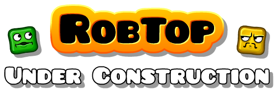
I'm pretty sure almost every single one of us thought that the font used in Geometry Dash is Pusab.
But actually, it really is not.
If we try to compare the font used in the game with Pusab, we get this:

They may look similar, but if you look closely, they aren't actually the same at all.
Notice that the letters A, M, N, Q and W look completely different from each other.
Not only that, the letters in Pusab look quite more round and much more fatter, when compared to the font used in the game.
|
|
|
|
Post by flash on Jul 22, 2017 1:45:16 GMT -5
it looks as if the 'a' is reversed, that's interesting..
|
|
|
|
Post by Deleted on Jul 22, 2017 1:49:52 GMT -5
 Isn't the RobTop logo font Pusab or is this the same thing? |
|
1,621 posts

|
Post by DoubleX on Jul 22, 2017 2:28:58 GMT -5
All this time I thought the font was Comic Sans
|
|
214 posts
Creator Points: 000
Favorite Level: Black Blizzard
Hardest Demon: Rated version of Paracosm Circles
Mini-Profile Background: ffffff
Mini-Profile Name Color: 000000
|
Post by EHater on Jul 22, 2017 2:51:40 GMT -5
All this time I thought the font was Comic Sans You can see an example of Comic Sans MS in Pikachu's posts btw. |
|
|
|
Post by Deleted on Jul 22, 2017 3:24:53 GMT -5
I think it still basically is the same font, just a different version.
|
|
|
|
Post by PersonMan on Jul 22, 2017 5:00:19 GMT -5
All this time I thought the font was Comic Sans wait what Comic Sans is very different from Pusab, although it still retains the rounded corners style. |
|
|
|
Post by Deleted on Jul 22, 2017 6:47:54 GMT -5
All this time I thought the font was Comic Sans wait what Comic Sans is very different from Pusab, although it still retains the rounded corners style. Pretty sure that was sarcasm. It's a lost language. |
|
|
|
Post by Jeyzor on Jul 22, 2017 10:32:51 GMT -5
seems like an altered version of it
|
|
246 posts
Creator Points: 263
Favorite Level: 1.9 Version of hypersonic
Mini-Profile Name Color: {"image":"https://media.giphy.com/media/ygAaR0n5RsyAM/giphy.gif","color":""}
|
Post by panman30 on Jul 22, 2017 10:40:32 GMT -5
Isn't the RobTop logo font Pusab or is this the same thing? look at the R's |
|
KrmaL
GD Moderator
I hate when people call me Krazyman, just call me Krazy, man.
601 posts
Discord: krmal
Clans: GeoStorm
Creator Points: 28
Favorite Level: yoy did
Hardest Demon: Bloodbath
Mini-Profile Background: 840000
Mini-Profile Name Color: 9400ff
|
Post by KrmaL on Jul 24, 2017 20:58:03 GMT -5
It looks like it's just a different version. I noticed the one available on dafont is different from the one in the game (as is the one you've shown) but other sites such as Font Squirrel and Urabn Fonts have the same one used in-game.
Edit: Did a little more research, I believe the one in-game is a more recent version. Dafont version is from 2005, and other versions (which are used in-game and looks a little nicer IMO) appear to be from 2008. Of course it's a freeware typeface, classic Rob. Strangely enough it's not listed anywhere on the creator's site dharmatype.com (flat-it.com redirects there as well) or their foundry page on some other sites, but posts there date back to 2006 so it's likely they've just gone back and upgraded it when posting it elsewhere.
|
|
|
|
Post by simonk10 on Jun 25, 2019 20:53:16 GMT -5
|
|
|
|
Post by simonk10 on Jun 25, 2019 20:54:14 GMT -5
|
|
|
|
Post by Dragon on Jun 25, 2019 21:52:45 GMT -5
Don't post on threads that are over 2 months old if you don't have anything new to add. Locking |
|


![[ℙ][✓] P1kachu Avatar](http://storage.proboards.com/6138434/avatar/NDhGXuXKEtESX0eQndmM.png)


