|
|
Believe
Jan 10, 2020 3:39:04 GMT -5
via mobile
Post by togglegenius on Jan 10, 2020 3:39:04 GMT -5
So yes.. this is a generic level and i want to ask you guys about my gameplay so that in the future i can improve in both gameplay and design Thanks  Id is 57581879 |
|
|
|
Believe
Jan 12, 2020 12:35:39 GMT -5
via mobile
Post by herobrine279 on Jan 12, 2020 12:35:39 GMT -5
I feel this is definitely generic, but the gameplay is way too boring for a 3 star level. My advice is too make better backgrounds and to not make generic levels
|
|
360 posts
Discord: Mam
Creator Points: 081
Favorite Level: Co Cię to kurwa obchodzi?
Hardest Demon: Poszukaj se.
Mini-Profile Background: 000000
Mini-Profile Name Color: b20000
|
Believe
Jan 20, 2020 5:53:31 GMT -5
Post by Cień Świetności on Jan 20, 2020 5:53:31 GMT -5
Shoo hero. Your rebirth level needs you more than this poor fella. I do "Believe" I need to put some heavy criticism on this level. Feel free to express your anger at me after reading this. Gameplay: 0.6/4 I consider myself to be quiet experienced with this topic, so where should I begin? Maybe let's start with usage of "Move" triggers. I see you like them a lot. It's not a bad thing, however overusing them might be hurtful to your level. The more moving objects, that you can interact with, the less predictable and stable your level becomes. It's not forbidden to move something from time to time but you'd have a better result, if you move objects with a little bit of nicety. Following portals looked funny as hell, I'll give you that. Although making them follow player's X and Y position is pointless, if you place portals in a one spot and limit the space around them, so avoiding them is impossible. You don't have to increase their size. Now that I "moved" portals subject I remember one part having a teleportal throwing you at a very far distance. I recommend you to keep entrance and exit on screen AT THE SAME TIME. If you want to put players somewhere higher/lower, use a cube gamemode and end their fall with a gravity portal to give some time to recognise what's waiting up ahead. Gameplay itself wasn't complicated but you need to set more specific way by better hazards placement. Also I took a screenshot, which forced me to lower your "Gameplay" rating significantly. You wonder "What is it?"? Take a closer look: 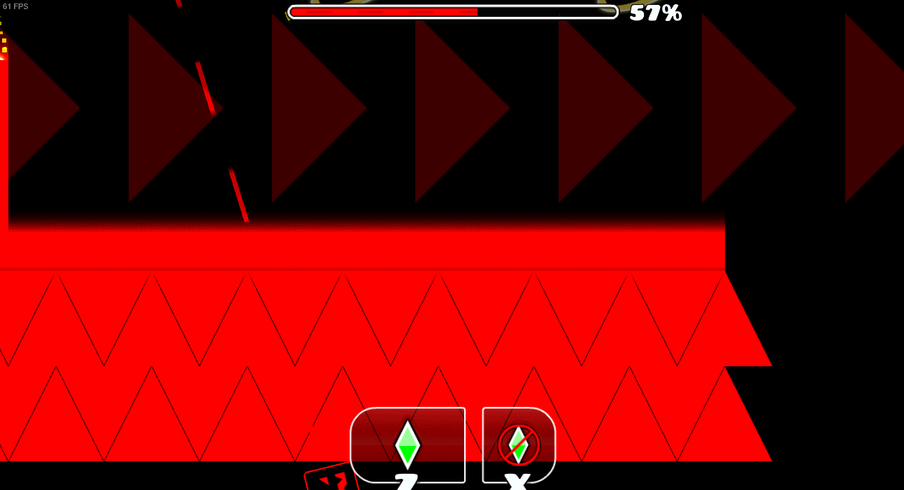 That is a huge "no, no". Progress is still possible. 'cause you didn't even put anything to end me the moment I jumped over a jump pad. Design: 0.7/2.5 I know the term "Generic" is associated with "repetitive" and "boring" but you tried to (maybe subconciously) take a step away from that trend. As a screenshot provided earlier shows, you had a concept. It's execution is a little poor due to leaving an empty space here and there between blocks. Same goes for 3D lines. It looks just unattractive most of the times. Give yourself a try and design each part with a bit of variety. 2 different blocks for structures. No mass duplication and no repeating blocks. Decorations: 0.5/2.5 They were... Yeah. The were... OK I don't know how to say this in the other way than, "They were bad and too exposed". Your custom backgrounds must meet a good ol' friend of everyone in 2.0 named "Alpha" trigger. Those BGs are way too visible and distracting. I'm aware at this point you tried to make a "generic" pinwheel effect but it looks horrific, as if it was cut with scissors. That pinwheel should be extended to be present at screen through all the time it spins. Many of your decorations looked like they had a way too close contact with a sharp tool, that just sliced them apart. If you feel like making a decoration, that doesn't reach the top from the bottom, just try to make an ending for it to smooth it and give it a better appearence. Also BLENDING lad. Use it. Use it on as many transparent deco as possible. Music Sync: 0.6/1 Personally I'm not a fan of vocals in music but between random UFO section and robot part I felt like jumps were designed to sync with lirycs. Nice. Summary: 2.4/10 - (Needs Improvement) You decided to copy the least favorite style of all players, yet you failed to recreate an already flawed style. Don't look at the others. Look at yourself. Look at blocks you have in the editor and ask yourself "What looks promising to me?". Don't be afraid to connect 2 different blocks and don't repeat your block design for too long. Reduce "Move" triggers to increase stability of gameplay and I recommend to NEVER move any key elements such as: -Orbs -Portals -Jump pads -Collectives (And slopes. Moving slopes generates lots' a bugs) Also blending. Test it. See how it works. And playtest your level a lot to avoid mistakes, such as portal skips and secret ways. Now I shall give you the time to absorb all the necessary information, convert it and put it to good use. I hope my next review is going to show mostly good parts of your creations. Good luck out there. |
|
|
|
Believe
May 18, 2020 11:35:24 GMT -5
Post by RFMX on May 18, 2020 11:35:24 GMT -5
Review approved. I am posting this video simply to better illustrate problem brought up by Cień Świetności, and add a little more into this. (Video will be up in minutes, probably.)
Cień Świetności Consider digging into BBCode to reduce the size of the picture. It's intuitive enough you don't need to learn any BBCode to do that.
>>> Moving to NI
|
|


 I'll send you the ID so you can get the level, copy it, and see it for yourself! The ID is 103580101!